
Visualize Execution Metrics Through Real-Time Dashboards Guide
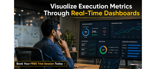

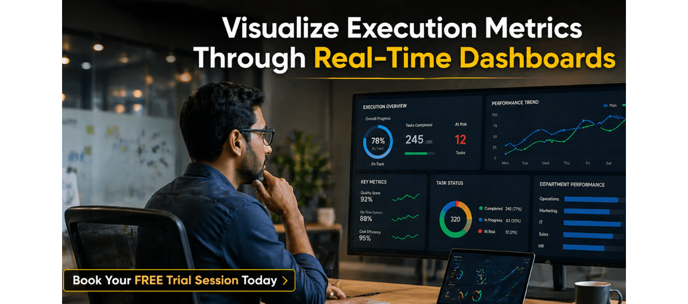
Execution Metrics Visualization Through Real-Time Dashboards
In today’s fast-moving work environment, execution without visibility is guesswork. Teams often make decisions based on last week’s reports, miss early warning signs, and spend hours in status meetings that could be replaced by a single well-designed dashboard. The gap between what is happening on the ground and what leaders actually know is where projects fail, budgets overrun, and opportunities are lost.
Real-time dashboards close that gap. They transform raw operational data into a living, breathing picture of execution health—surfacing what is on track, what is at risk, and where immediate action is needed. For working professionals, the ability to read and build these dashboards is rapidly becoming a core career skill rather than a technical luxury.
This guide provides the frameworks and checklists required to build dashboards that do more than just report data—they drive decisions. By following these structured steps, you can move away from reporting theatre and toward execution intelligence.
Download these resources and apply them alongside your daily work for improved clarity, productivity, and professional growth. You can also book a free trial to gain expert guidance and enhance your communication, problem-solving, and decision-making skills. The materials are designed in a clear, structured format to help professionals learn efficiently and implement insights with confidence.
Who Is This Blog For?
- Managers needing real-time visibility into team performance
- Consultants building progress-tracking tools for high-stakes clients
- Career switchers entering data-driven roles or industries
- Project leads tired of manual status reporting and long meetings
- Working professionals looking to enhance their analytical and decision-making skills
Why This Topic Matters Today?
Decisions made on stale data are inherently risky. In a competitive professional landscape, the speed of information often dictates the speed of success. Many professionals struggle not because they lack data, but because they are drowning in noise. Without a system to filter and visualise what matters, critical signals are missed.
Modern professional execution requires:
- Replacing manual reporting with automated, live data sources
- Moving from vanity metrics to decision-driven indicators
- Visual clarity that allows for interpretation in under five seconds
- Thresholds that trigger action before a project reaches a crisis point
Core Concept or Framework Explained
The foundation of a high-impact dashboard is the Decision-First Architecture. Most people build dashboards by looking at what data they have; this guide suggests building backwards from the decisions you need to make.
The Architecture of an Effective Dashboard?
A professional dashboard should follow a three-zone layout to ensure maximum clarity:
Zone 1: Status at a Glance
This area uses high-level indicators to show the current health of a project. It answers the question: Are we winning or losing right now?
Zone 2: Trend Over Time
Data in isolation can be misleading. This zone provides context by showing whether a metric is improving, declining, or remaining stable over days, weeks, or months.
Zone 3: Drill-Down Detail
For the metrics that are underperforming, this zone provides the underlying data points. It allows a user to identify the root cause of a problem without leaving the dashboard.
How This Blog and Guidebook Help You?
This resource and the accompanying playbook provide:
- A step-by-step method for selecting metrics that drive action
- Design principles for visual clarity and rapid interpretation
- Checklists for automating data sources and ensuring data trust
- A quarterly audit cadence to keep your dashboards relevant
The result is a system that makes the right decision obvious at the right moment, saving time and reducing the cognitive load of project management.
Step-by-Step Breakdown
Step 1: Define Decisions Before Metrics?
The first step in building a dashboard is identifying the specific decisions it must support. For every metric you consider, ask: If this number turns red, what specific action will I take? If there is no clear action, the metric is likely noise and should be removed.
Step 2: Select the Right Visualisation?
Match your chart type to the data relationship you are showing. Use line charts for trends, bar charts for comparisons, and gauges for status against a goal. A dashboard passes the professional standard if a viewer can interpret the state of play in under five seconds.
Step 3: Pre-Define Your Thresholds?
Green, Amber, and Red indicators only work if everyone agrees on what they mean before the data changes. Define these thresholds during the design phase to remove emotion from the decision-making process when a project hits a snag.
Step 4: Automate Your Data Sources?
Manual dashboards are prone to error and quickly become stale. Connect your dashboard directly to your live data sources—such as project management tools or spreadsheets. If a dashboard requires manual entry, it will eventually be ignored.
Step 5: Operationalise the Review?
A dashboard is a tool for a meeting, not a replacement for one. Use your dashboard to anchor your weekly or daily stand-ups. Focus only on the metrics that are off-track, allowing the team to spend their time on problem-solving rather than status-sharing.
Step 6: Audit Quarterly?
Your priorities will change, and your dashboard should evolve with them. Schedule a quarterly review to remove metrics that are no longer useful and add new indicators that reflect your current strategic focus.
Common Mistakes or Pitfalls to Avoid
- Reporting theatre: Tracking metrics that look good but do not influence decisions.
- Overcrowding the layout: Too many charts create visual noise that hides the most important signals.
- Using the wrong chart: Using a pie chart for a trend over time makes the data impossible to read accurately.
- Lack of data trust: If the dashboard is not automated, the team will eventually question the accuracy of the numbers.
- Static design: Failing to update your metrics as the project goals shift.
How Should You Use This Guidebook Effectively?
To get the most out of this system, start with a 30-day implementation plan. In Week 1, map out the three most critical decisions you make each week. By Week 2, design a low-fidelity wireframe of your dashboard. By Week 3, connect your first live data source. By Week 4, run your first meeting using the dashboard as your single source of truth.
Key Takeaways
- Decisions must always come before metrics
- Use the three-zone layout: status, trend, and detail
- Visual clarity in under five seconds is the professional standard
- Automate data sources to ensure accuracy and build trust
- Pre-define thresholds to trigger objective actions
- Audit your dashboard quarterly to keep it aligned with priorities
- The goal is to make the right decision obvious, not to show everything
Your Next Step: Accelerate Your Career with PlanetSpark
Creating an impact-driven resume is not just about landing your next job—it’s about owning your professional story and presenting it with clarity, confidence, and credibility. When your resume clearly communicates value, results, and impact, opportunities follow naturally.
At PlanetSpark, we are committed to empowering working professionals with practical, outcome-focused resources that drive real career growth. From resume building and workplace communication to leadership presence and professional writing, our programs are designed to help you succeed in today’s fast-evolving job market.
Visit https://www.planetspark.in/resources to explore:
- Career and resume-building guides
- Workplace communication and professional writing resources
- Skill-development tools curated for working professionals
Want a deeper, hands-on experience?
You can also book a free trial session to learn more about PlanetSpark’s Working Professional Courses, designed to accelerate your career through personalised coaching, real-world practice, and expert guidance.
Your career deserves more than generic advice.
It deserves clarity, confidence, and measurable impact.
Personalized Communication Roadmaps
Record a video to get a AI generated personalized communication reports